
Most days, my kids will make their way across the garden to my office and ask for a printout to colour.
Pikachu, Batman, Motorbikes, Monster Trucks … it’s often predictable, anything boys under six like.
At times, it can get wildly specific (e.g. batman riding a motorbike and shooting laser beams from his eyes) and I remind them it probably doesn’t exist, but we search anyway.
For a simple request, finding a design on Google Images is easy. The next step of clicking on the image and landing on its horrendously unusable website is a different story.
I totally get that expecting a great user experience on such a trivial website is probably asking too much, but surely to satisfy their business model of displaying ads, returning users is a good thing, right?
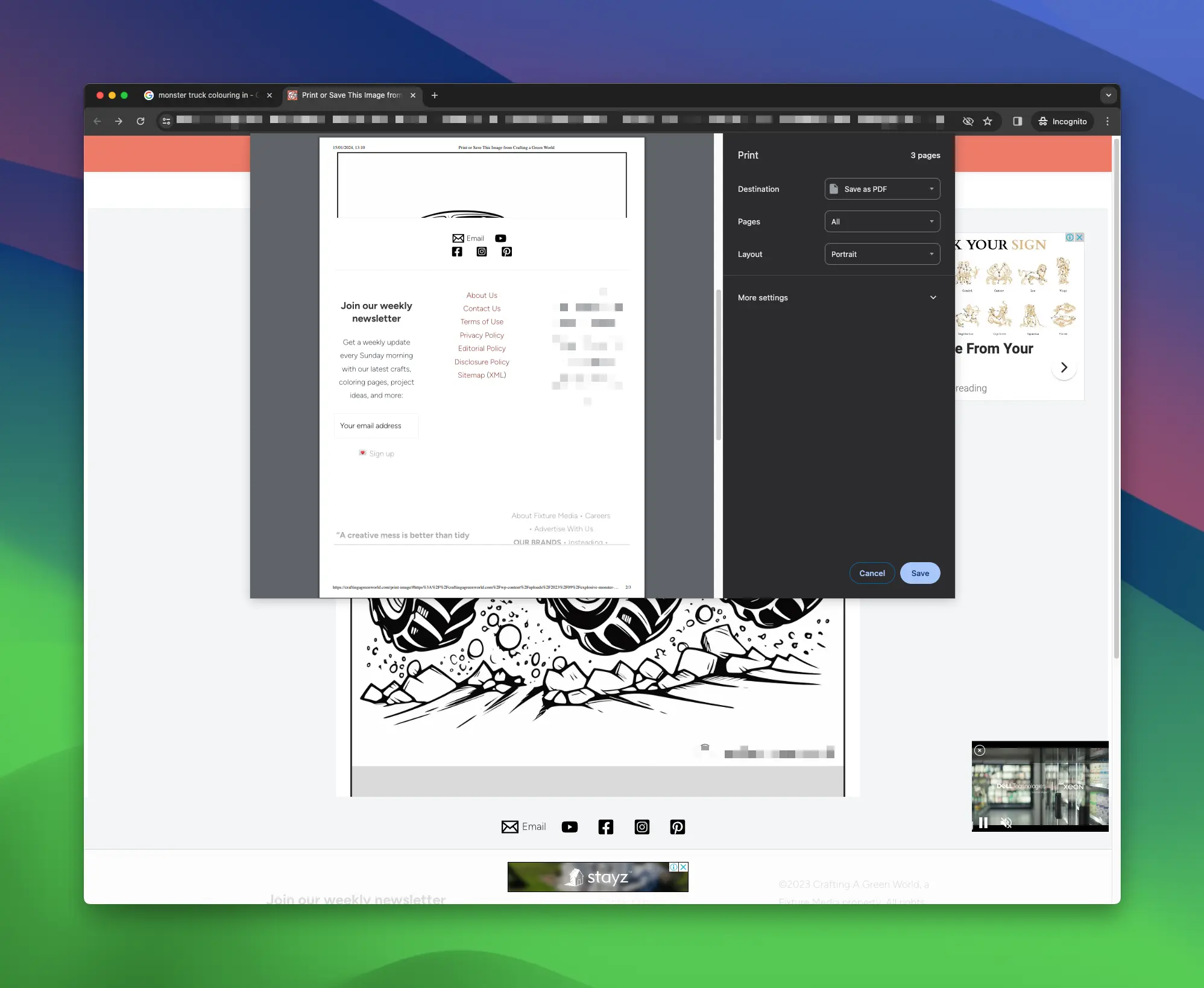
Too often when I go to print, I’m greeted with this mess:
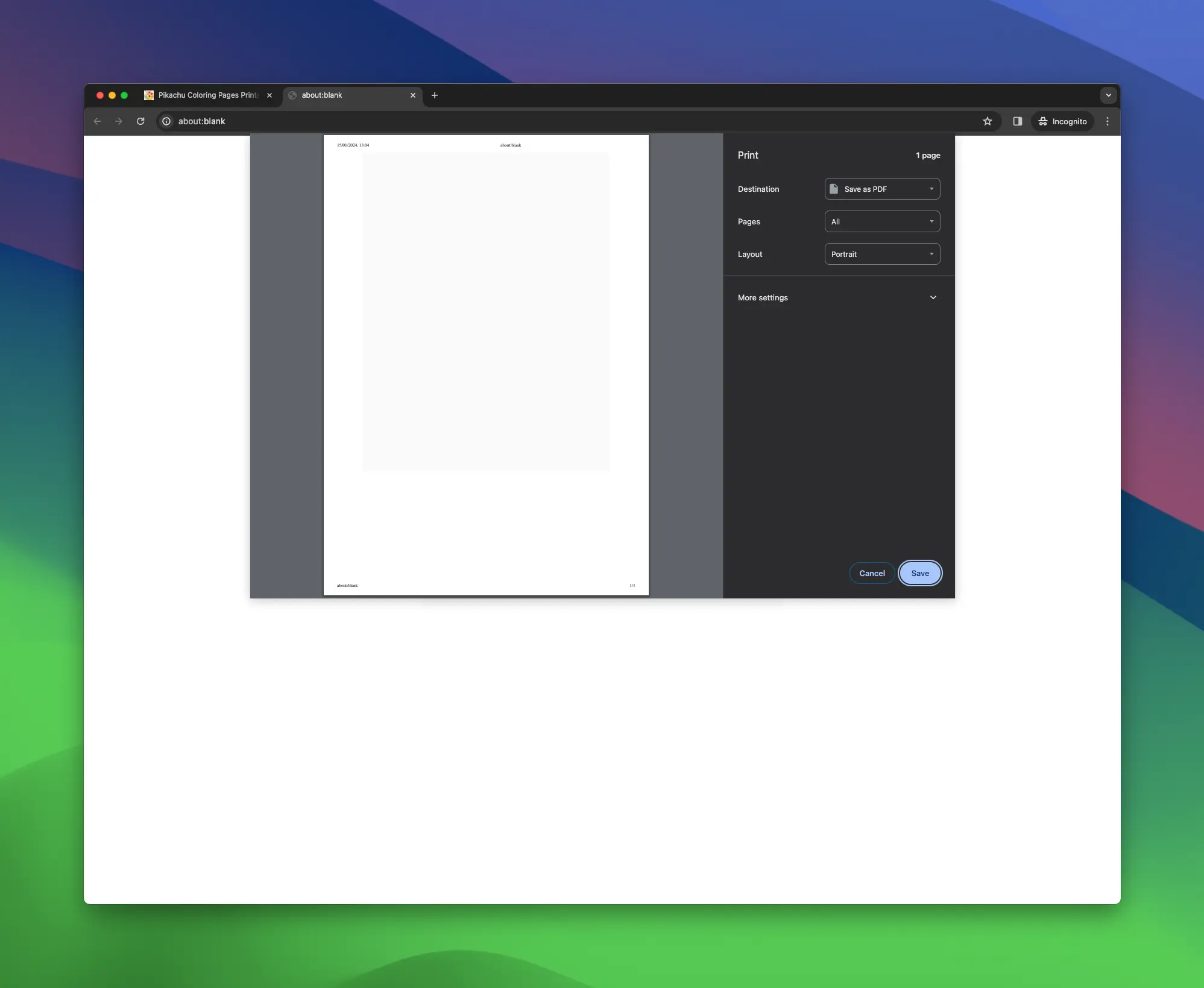
Or, the classic blank page:
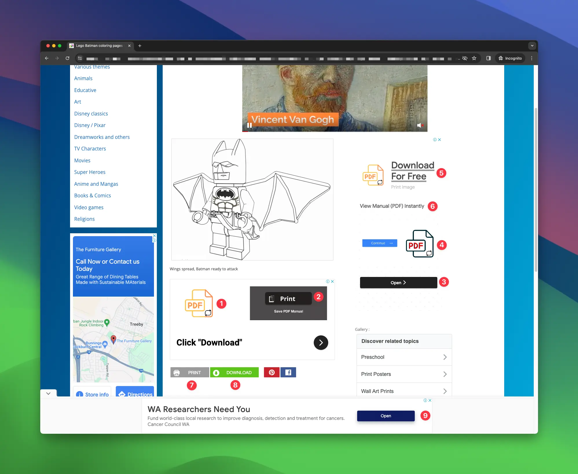
Or, they’re working way too hard for their ad money and for most users, they wouldn’t know where to click. Here are nine buttons that either say Download, PDF, Open or Print.
And then frustration hits and I lean into my dev background, fire up the inspector, find the image URL and open it in a new tab.
But, not everyone can do that.
These types of websites should be super quick and easy to use for the stressed parent trying to appease their child.
We can do better.
Maybe that’s my next project. Create my own beautifully designed, easy-to-use kids colouring-in website.