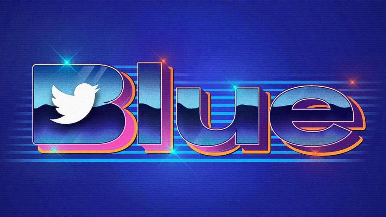
Fair go for trying something different, but it’s pretty awful. This article nailed it.
https://www.fastcompany.com/90823987/elon-musk-twitter-blue-logo
Just look at it! I don’t know who designed it. Maybe someone from accounting made it, since it’s safe to assume there may not even be a design department at Twitter after all the massive layoffs and ultimatums. Perhaps he prompted a generative image AI to create a “logo that combines the word ‘blue’ with the Twitter bird brand, ’80s porn production company, CorelDRAW clipart CD, LOL.”
I doubt we will ever know who perpetrated this nonsense or why they did it. It may have been Musk himself using the screensaver tool from Microsoft’s 1995 operating system. He wouldn’t be the first nor the last CEO who got his hands deep into the corporate image of their own company.
You don’t have to be a typography expert to see that there’s no structure to the lettering—especially that fattened B with the bird as the counter. It’s just gross and barely legible; the shiny color version can’t be reproduced anywhere in any reliable way, and it doesn’t even fit Twitter’s own corporate standards (this thing doesn’t even attempt to be blue, it’s purple and pink and whatever… is that gold or tropical orange? The hell I know).
